Why the obsession with long home pages?
October 29, 2014 • Glenn Murray

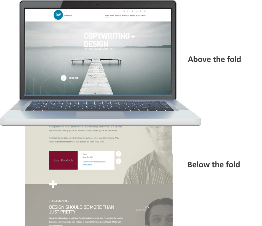
Last week, I wireframed a client’s new home page. He reviewed it over the weekend and, today, asked what I plan to put ‘below the fold’. My answer:
“Nothing. I don’t think you should use a long home page.”
Why? Well first, let me clarify what ‘below the fold’ means…
Before I explain the above answer, here’s what he meant by ‘below the fold’. (Using part of my home page as an example.)
Now… Why not use a long home page?
A lot of sites these days are opting for the long home page approach, where the reader has to scroll (sometimes a lot) to read the whole thing.
But you shouldn’t make the home page long just because others are. Or just because you can.
The aim of the home page is to engage your reader, to draw them in and to get them to do something. There’s no need to jam everything onto it. In fact, in most cases, I think the less you put on your home page, the better. Keep it focused, clear and succinct. Limit choices, so readers don’t get lost or feel overwhelmed, and your calls to action are crystal-clear.
The last thing you want is for people to be paralysed by choice. (It happens… Read Dan Ariely’s Predictably Irrational.)
Most of the time, I think you should use a short home page that links off to multiple sub-pages (via call to action buttons, in-line links and the main navigation menu).
People will also feel comforted by the organised nature of the information. Your links tell them exactly what to expect when they click, so they’re risking less by clicking the link than scrolling down the page on the off chance they’ll find the information they want.
When is a long home page justified?
Of course, that doesn’t mean you can’t use a long home page. Just don’t do it simply because you can. Unless you have a really good reason.
What’s a really good reason? Well, the most obvious is when you have some info that absolutely must appear on the home page, and it can’t fit above the fold. Another would be if you feel using fancy parallax scrolling effects will impress (and convert more of) your readers.
(Incidentally, both of these conditions apply to my home page: 1) I wanted the home page to tell the story of my collaboration with Ian; and 2) I wanted it to prove we can design and develop elegant long pages with parallax scrolling.)
What do you think?
Do you use long home pages? Please comment with your thoughts.
David Brewster wrote on October 28th, 2014
I understood that the trend to longer 'scrolling' pages was largely to do with increased used of mobile devices. Problem is that 'above the fold' doesn't mean much anymore when your page (hopefully responsive) changes shape from phone to tablet to desktop. In addition, scrolling is easier on a mobile device than clicking buttons. But that's about the extent of my knowledge on the topic!
Reply
Glenn Murray wrote on October 28th, 2014
Ah, right. That may be. Not sure. But I'd suggest scrolling and info-overload on a mobile are even less desirable than on a desktop...
Reply
Bek wrote on October 29th, 2014
I think it may have something to do with mobile and tablet design- but then my issue with that is why create around one market? Why not have a website that works responsively (properly!) or elect to have a mobile version if that is what you need? The parallex love affair has every website looking the same. Plus, a lot of places don't know how to do SEO properly when it comes to parallex, so there's that. AND why oh why, in a world enamoured with A/B testing, are we now creating the bulk of our information on one page so we can't test for relevancy or interest? I think it'll go the way of auto play music, flash intro's and novelty mish mash menus- straight to the "what was I thinking?" bin of 2016.
Reply
Anna Butler wrote on October 29th, 2014
I usually tell my clients that their home page is like the dust cover and 'contents' page of a book. It should have some kick-ass copy to entice the user to delve deeper into the site and also give the user an idea of what the site is about and where to find what they need. Instead of a chapter and corresponding page number, however, they would have a page title and hyperlink. And totally agree with Bek's comments. She's a smart cookie, that one.
Reply
Matt Fenwick wrote on October 31st, 2014
Oh my gosh yes. What you risk loosing with a long homepage is the gestalt. Many pages that go on for an eternity don't give a clear statement up top about 'this is what we do, and this is why that matters'. Whether that info appears above the fold or not, it should be sooner rather than later! Long homepages impose too much on visitors' good graces, assuming that they'll know there's pure gold just a few more swipes away.
Reply
Peter Wise wrote on November 30th, 2014
A homepage needs a reasonable amount of copy to deliver your main message and to introduce the rest of the site. I sometimes have to persuade clients/their designers that you should have a decent introduction on the home page when they want no copy or just a line or two. Mind you, at the other extreme I did have one designer telling me recently that I should write at least 1,500 words for the homepage as "Google ranks longer really long pages better". So never mind the quality, feel the length! I also have one client with a massive site who kept on and on adding copy, text boxes, gizmos, thumbnail pics, revolving banners and links to the homepage, which of course ended up being counter-productive. There was just too much going on, for both the visitor and Google. Once I persuaded him to simplify it he started getting better results.
Reply