Ian re-designed the new TechCrunch website in 1 hour
October 16, 2013 • Glenn Murray

We just saw the new TechCrunch web design. Ian said: “Meh! They should have given it to us!”
He bet me $50 he could do better in an hour. I didn’t doubt it for a second, but I thought it’d be a bit of fun, so I took the bet.
55 minutes later… (click to zoom)
Obviously not finished, but you get the idea…

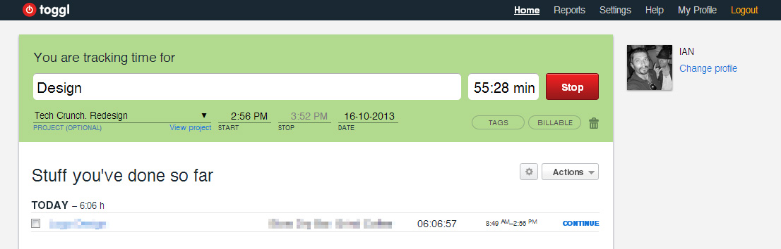
And here’s his project timer…
Oh, and here’s the ACTUAL TechCrunch design

So… Do I owe him $50?
What do you think? Is it better than the new TechCrunch site? Please comment…
Brett wrote on October 16th, 2013
Looks like Ian just made $50. Techcrunch might love the layout and design. So why not pitch it to them. Better still let's just use our networks to make this happen.
Reply
Peter wrote on October 16th, 2013
Ian delivered. I don't blame the designers of techcrunch, though. It could very well be a case of "too many cooks..."
Reply
Ian Butler wrote on October 16th, 2013
Totally agree, Peter. As with most big sites, everyone has an opinion! Plus I had the advantage of doing exactly what I wanted, cheating by not using 'real ads' (which would dilute the look). But still no excuse for what a big company has done. We love TC, but the new look is a complete hotchpotch!
Reply
Roland wrote on October 16th, 2013
+1 for Ian's design
Reply
Dan Petrovic wrote on October 16th, 2013
I like it, but keep thinking about how much research must have gone into their design and some of those things they did must be for a reason... for example the news item timeline concept - that's kind of neat.
Reply
Krissy wrote on October 16th, 2013
+1 for Ian. The actual TC site makes me a little stabby.
Reply
Ian Butler wrote on October 16th, 2013
Agree, they must have had a lot of people working on and planning and adding their 2 cents worth. Still can't hide the fact it looks like a dogs dinner put together by someone with no eye for aesthetics... ho hum!
Reply
Ian Butler wrote on October 16th, 2013
Thanks for the vote ; ) 'Stabby'... lol. I think I know what you mean!
Reply
Chris Sutton wrote on October 16th, 2013
+rather a lot more for Ian, I do like the timeline but the rest of it just gives me the irrits...
Reply
Gabriella Sannino wrote on October 16th, 2013
Okay, Ian won. The design is cleaner, less wasteful, & much easier on the eyes in regards to readability. But I do agree with Peter, it may be a case of too many cooks. ;-)
Reply
Peter Crocker wrote on October 16th, 2013
Nice one Ian! Very slick and clean - amazing how much clean slate free of legacy and committees can speed up and improve the creative process. Wonder what you'll spend your $50 on :)
Reply
Glenn Murray wrote on October 17th, 2013
LOL: "stabby"!
Reply
Glenn Murray wrote on October 17th, 2013
I'll never pay up. NEVER! ;-)
Reply
Anna Butler wrote on October 17th, 2013
What's that? A split test? There's a pitch you should send them :) (And FWIW - Ian's wins for me)
Reply
Glenn Murray wrote on October 17th, 2013
Yeah, we'd love it if they ran a split test.
Reply
Alexander John wrote on November 5th, 2013
With the new design on TC the ads are huge! It's almost like their saying, "we care about money more then content." ...but what would I know I guess I wish I had a million dollar website like that.
Reply
Glenn Murray wrote on November 5th, 2013
Thanks for your comment, Alexander. Yeah, they make some big dollars, and they have some very good content. But might isn't always (often) right... ;-)
Reply
33 software tools for freelance copywriters wrote on April 10th, 2015
[…] If you’re wondering, here’s the post that attracted all those simultaneous visitors: Ian re-designed the new TechCrunch website in 1 hour. […]
Reply